Business data visibility
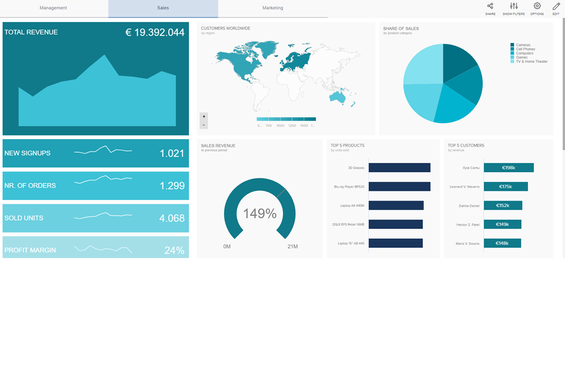
Get visibility of all your business data by building a fully customized dashboard to visualize any data you’re holding within KulaHub, Google Analytics, Google Sheets and more, bring everything together
With an enhanced dashboard, you get a high level or granular overview of your data as it goes through your sales process. You’ll be able to track all your sales and marketing activities, so you can ensure you’re investing in the right places to drive sales.
Reports tailored to display what your business values most
Whether you’re in management looking for that high-level overview of sales or needing to track trends within your client or product base, KulaHub’s dashboards allow every business to pull specific information within the CRM that their business values the most.
Avoid business asteroids and getting bogged down with irrelevant information, focus on your key data points whilst enabling team leaders and management to see real-time insights of any CRM, Marketing or Project activity.
Never miss business trends or opportunities.
